Candlestick Charts – Understanding All Patterns Easily: Candlestick pattern is a tool for technical analysis of an organization. It shows the movement of the price of financial instruments, graphically, in a candlestick chart and helps in predicting price directions.
Originated back in Japan, the candlestick is a powerful trading concept. What makes this fantastic tool more potent than traditional charts is its ability to capture highs and lows of every move. In other words, it can pack more data into a single bar.
Every trader, whether a beginner or experienced, should be aware of this fantastic trend analyzer. It not only helps to predict the future price but also tells when to enter or exit the market. In this article, we would be covering the basics of candlestick charts. Starting with its components, we would move to various types of patterns.
Components of Candlestick Charts
The critical component of a candlestick chart is that it shows four things – the highs & lows of the session, the opening price, and the closing price.
And, apart from that, it has three main features:
- Body: It represents the opening and closing price
- Shadow: Also known as the wick, shows the highs and lows (price) of the session.
- Colour: It works in either green or red colour; or perhaps, in some cases, it might be black and white. Sometimes you can even change the colour if you want, but generally, the most common colours are green and red. These colours show the momentum of the market price, whether bullish or bearish.
For a bullish price trend, it’s either green or white; and for a bearish trend, it’s either red or black.
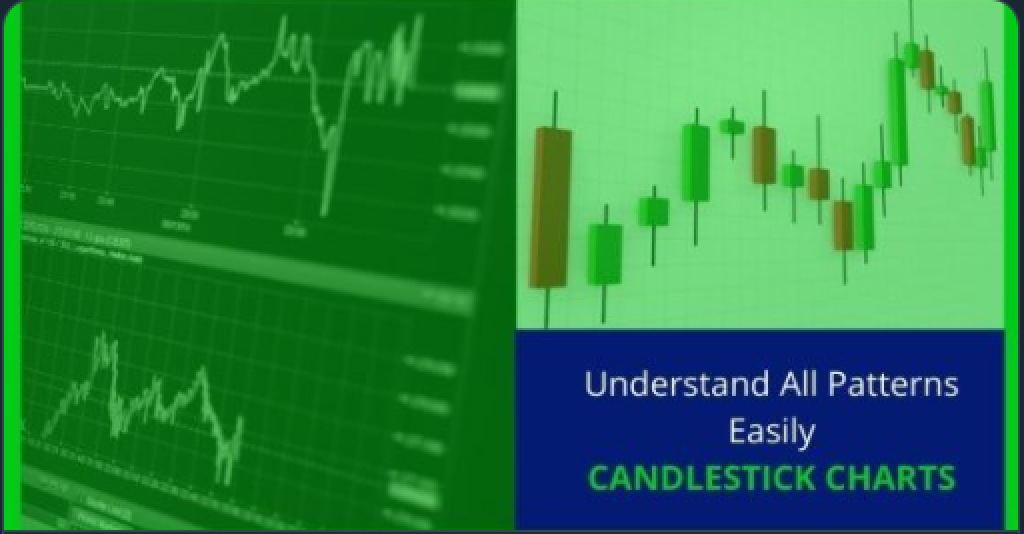
Here is an example of how a candlestick looks-
Also, Don’t Forget,
For a bearish candlestick, the open is always above the close. (Red or Black) and, for a bullish candlestick, the open would be below the close. (Green or White)
You look quite confused!
Let’s understand this in simple words.
Take the case of a bearish market. A bearish asset opens up at a higher price, but due to a downward trend, it closes below the open.
Note that there’s nothing more complicated trading pattern than candlesticks. However, it is also the most data-packed chart pattern. Thus, without wasting a second, let’s move ahead to our next section.
Types of Candlestick charts and patterns
There are dozens of identified trends in candlestick patterns. Some of them are more popular than the others because of its accuracy and reliability. While the complexity of each candlestick is different, we would try our best to make it easier for you.
Engulfing (Covering completely)
It is a two-candle pattern in which the second candle engulfs the body of the previous candle.
If we talk about a bearish market, then the engulfing candle comes at the end of an uptrend where a red candlestick engulfs the green one. Similarly, in a bull market, green candlestick overshadows red candlestick.
It shows that the market has changed its trend now. The bullish engulfing pattern indicates a surge in the buying pressure. It means more buyers will enter the market and bring the price up further. However, a bearish engulfing pattern is precisely opposite of bullish engulfing and indicates the selling pressure where it may drive the prices down in the future.
Hammer and Inverted-Hammer
Hammer and inverted-hammer are bullish patterns of a downtrend. The body of the candle is short here with a long lower wick. Did you get why the name hammer now?
Hammer shows the price rejection of lower prices in the market. It is a sign that sellers somehow took the price of a commodity down. However, eventually, buyers were the ones who outperformed here.
Inverted-hammer is the inverse of the hammer, which shows buying pressure followed by a selling pressure; eventually, prices closed a little above than opening.
Hanging Man:
Hanging men are bearish candlesticks and have the same shape as the hammer. The only difference between the two is that the hanging man appears in an uptrend.
Hanging man pattern is usually seen after a short uptrend, in a down going chart. It warns that bulls are losing balance and is about to fall further.
Doji:
Doji is a situation where open and close prices are the same. When the momentum of both buyers and sellers were unable to change the price, then a Doji was formed. It looks like a Plus sign and indicates price rejection among the users. There are two types of Dojis.
Dragonfly Doji:
As the name suggests, the dragonfly is a bullish pattern which means it occurs at the bottom of a downtrend. It indicates that the market opened and the sellers degraded the price. But, the buyers take control soon and bring the price to its initial level.
Gravestone Doji:
It is the opposite of dragonfly Dojis where opening, closing and low price meet and the candle has a long upper wick. It’s a bearish pattern and shows that buyers started strong, but the seller’s pressure came soon after. It brought the price at the lower level and finally, it closed where it had opened. It shows weakness as sellers are in power, and it tells you that the market has rejected higher prices.
Spinning Top:
A spinning top is an indecisive market pattern where buyer and seller both fight for their control, but none succeeds. It results in a small candle body and a long upper wick. It is similar to a Doji but, here there’s a minor difference between the closing and opening price.
Morning and Evening Star:
A rarely seen pattern but if seen must not be avoided. The morning and evening star pattern suggests the trend reversal.
A morning star is a bullish pattern and forms at the bottom of a downtrend. It’s a three candle pattern- the first candle is a long bearish candle, the second candle is a small bodily Doji candle, and the third is a bullish long candle.
Similarly, an evening star is a bearish pattern which occurs at the top of an uptrend, showing a negative sign in the market. It’s also a three candlestick pattern- the first candle is bullish and long, second is a Doji, and third is a long bearish candlestick.
Tweezer Top and Bottom:
It’s a two or more candlestick pattern. A reliable pattern which indicates a shift in market trend. The tweezer top is a bearish pattern, which appears in an uptrend. It shows bull prices on the first day, but on the second day, the market reverses, moves straight down, which may result in eliminating previous day profit. Just remember, both candles will be high at the same level.
A tweezer bottom is opposite of tweezer top. Hence, it is a bullish pattern. For the first day, it shows low prices throughout the day, but on the second, it moves upwards and shows a reversal trend which covers previous day losses too. Visually, the second candle must be longer than the first one. Both candles must have the same low price here.
Three Black Crows and Three White Soldiers:
Three black crows is a bearish pattern appearing after an uptrend. It looks like a staircase; each candle should open below the previous day’s opening. The trend indicates the sharp reversal of the market from the bull market to a bear market.
Three White Soldiers is precisely the opposite of Black Crow. It’s the three consecutive long bullish candles, all of the same size. If the third candle is smaller than preceding two candles, it shows buyers are not wholly in control, which may indicate weakness. The candles have no or little upper shadow/wick.
Piercing Line and Dark Cloud Cover:
Piercing consists of the two-day candle where the first candle is long bearish and second is a long bullish candle. Remember, the second candle is lower than first and should cover at least half of the upward body of the previous red/black candlestick. There is a downward trend before the piercing, and this pattern implies a potential reversal from downward to an upward trend.
Dark cloud cover is precisely opposite the piercing line. It’s a bearish pattern where the first-day candle is the bullish and second-day candle is bearish. The closing must be above the opening of the previous candle. It shows a shift in the momentum from the upside to the downside. It shows market prices will go down further.
So, these were the types of candlestick chart patterns. Reading all of them effectively would help you spot potential opportunities and threats. Moreover, with the help of these, you will also be able to make better entry and exit decisions. Also, these are not the only candlestick patterns, but these are the most popular ones.
Now, before ending this post, below is a piece of final advice for you. You must not skip it.
The Final Say: Candlestick Charts
In the last 3-4 years, candlestick charts have gained significant popularity among traders. The reason is the extensive information in a single chart. However, traders should not rely wholly on this technical analyzer. Like any other tool, this also has some drawbacks. Also, the candlesticks would not prove to be much useful in the short run.
But, it sometimes does wonders when you want to invest in an asset for the long run. Remember to use this technical tool after doing your fundamental analysis of a company. Because many times we have seen people deciding solely depending on a single tool and regret later.
Candlestick pattern charts are not available with every trader. Thus, make sure your trader has one. And, if you are someone who is looking to open a trading account, then here is a list of the best forex broker in the UK. One of them is Investby.

